leaflet designs

Above was one of the first front cover designs for the leaflet. i wanted to portray a natural feeling but very quickly scrapped it due to it not really fitting the brief and didn't suit Elgar.


above is the front and back cover for my second design. i felt this portrayed a historic nature trail by the earthy tones used and organic photos. i decided to go against this design as i felt is was better suited to a nature trail or something along those routes instead of an historic route about elgar.

above is my final leaflet cover design (front and back). the yellow on the left will be cut out around the black outline (malvern hills outline). the yellow is a flap which wraps from the back to the front meeting the edge of the title on the front. i felt this design was best suited and had a modern edge to it whilst celebrating elgar and the wonderful scenery around.


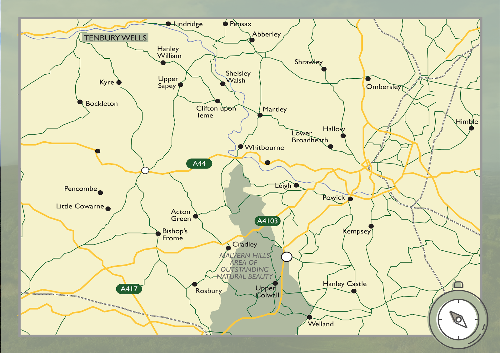
above is the different pages in the leaflet. the top image is of two separate pages. the second of a double page spread which can be read as one or as two individual pages and the bottom of the a3 fold out map. below is the removal strap which will be over the leaflet. it is more of a design accessory rather than having a practical use.


Comments
Post a Comment